
PACKAGING COLOUR GUIDE
RGB, CMYK or Pantone? A Simple Packaging Colour Guide
Choosing a colour on screen is easy. Making that colour look right on a paper bag or gift box takes a little more planning.
The good news is that you do not need to become a print technician. For most packaging projects, one simple rule is enough:
- Use RGB for screens and digital content.
- Use CMYK for most full-colour printing.
- Use Pantone when a specific brand colour needs tighter control.
The best choice still depends on the artwork, paper, finish, printing method, quantity and budget. This guide explains the differences in plain English and shows what to confirm before approving your custom packaging.
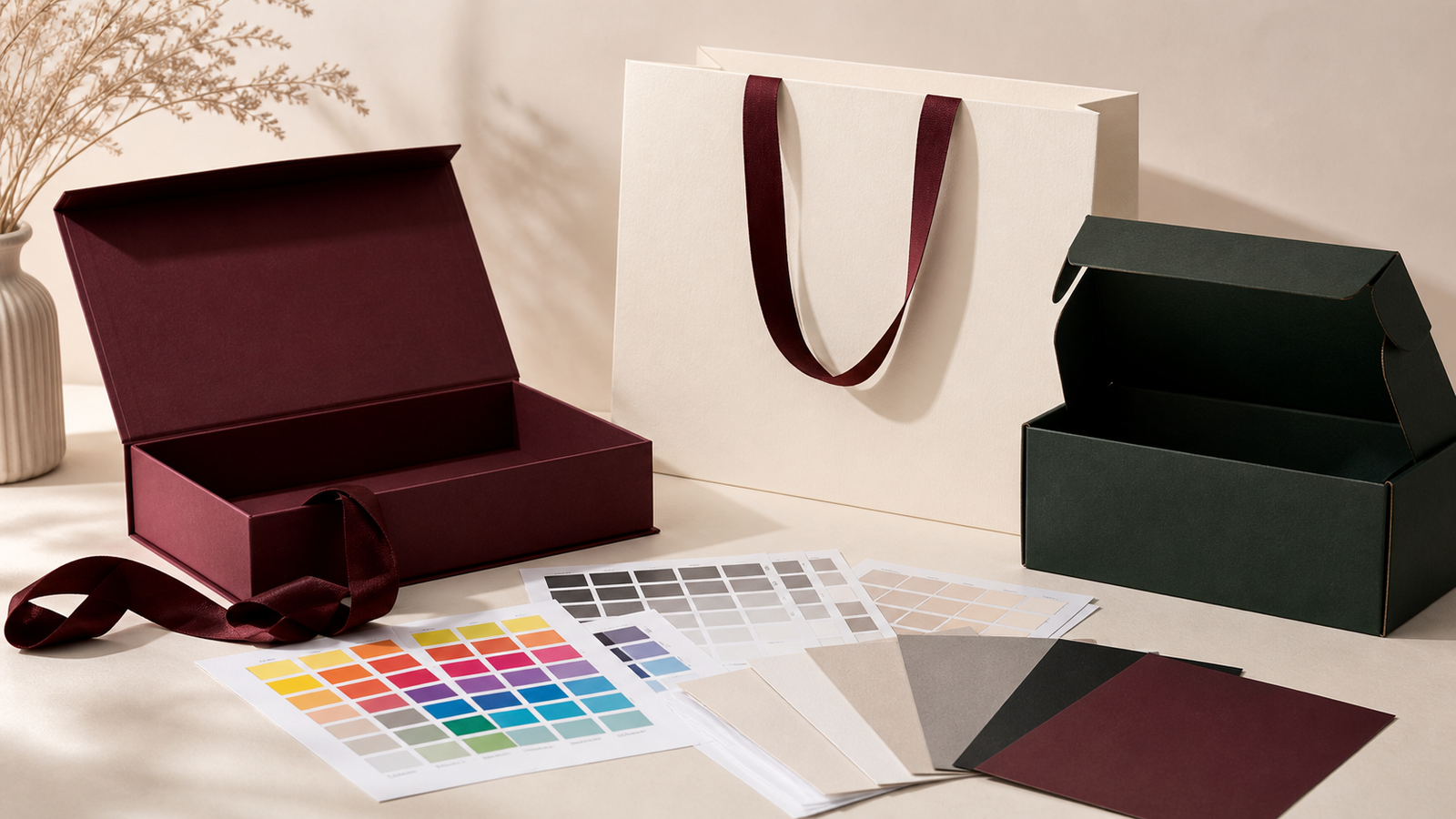
Why does a printed colour look different from the screen?
A screen creates colour with light. Printed packaging creates colour with ink reflected from a physical surface. These are different systems, so a bright colour on a phone or laptop cannot always be reproduced exactly on paper.
Screens also vary. Brightness, contrast, display settings and ambient light can make the same design look different from one device to another. A printed result changes for other reasons, including the paper colour, surface texture, ink absorption, print process and finishing.
This is why a screen preview is useful for checking a design, but it is not a guaranteed colour standard.
What is RGB?
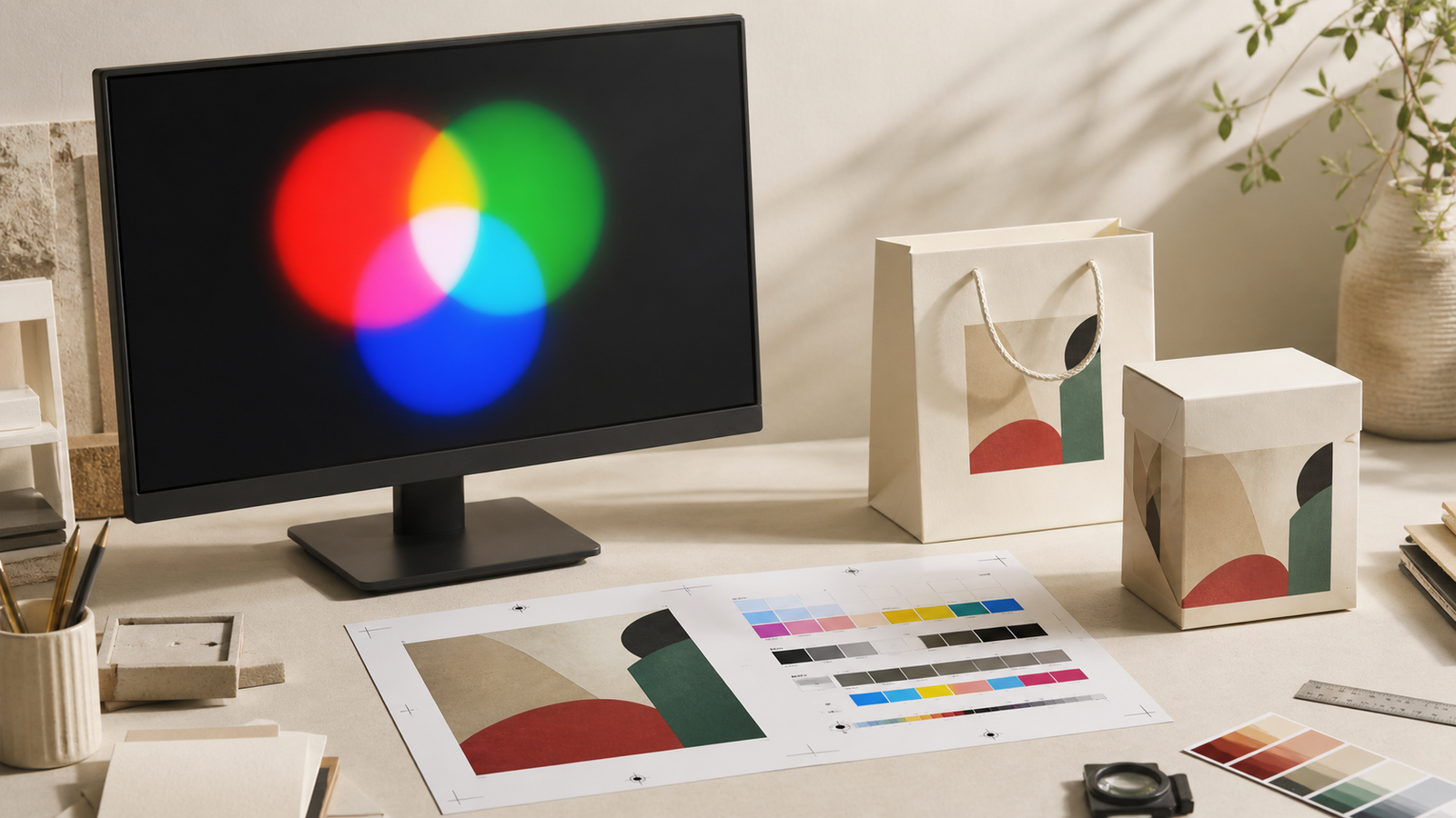
RGB stands for red, green and blue. It is an additive colour model, which means coloured light is combined to create the final colour. At full intensity, red, green and blue light combine to create white.
RGB is used for websites, social media, digital advertising, photography and anything mainly viewed on a screen. In a common 8-bit RGB file, each colour channel has a value from 0 to 255.
RGB can show some bright and vivid colours that sit outside the range of normal CMYK printing. When RGB artwork is prepared for print, some colours may become duller, darker or simply different after conversion.
For packaging, an RGB file can still be useful as a visual reference. It should not be the only colour instruction sent to production.
What is CMYK?
CMYK stands for cyan, magenta, yellow and key, meaning black. It is the standard four-colour process used for much commercial printing.
Instead of mixing coloured light, CMYK printing places small patterns of the four process inks on paper. Viewed at a normal distance, those dots visually combine to create photographs, gradients and thousands of colours.
CMYK is usually a practical choice when your packaging includes:
- photographs or product images;
- several colours;
- gradients or detailed illustrations;
- full-surface printed artwork;
- different designs sharing the same production method.
Because the same four process inks create the complete design, CMYK is often more economical than using several separate spot colours.
However, CMYK is not one perfectly fixed appearance. The final result can shift with the press, ink, colour profile, paper and finish. A CMYK value that looks right on coated white paper may look softer on uncoated stock and quite different on natural kraft.
What is Pantone or PMS?
PMS stands for the Pantone Matching System. In packaging, a Pantone colour is commonly used as a spot colour: a specific ink is mixed before printing and applied with its own printing plate.
Pantone references are useful when a logo or signature brand colour needs to remain more consistent across production. They can also provide colours that are difficult to reproduce with standard CMYK, including some cleaner, brighter, metallic or fluorescent shades.
Each Pantone reference includes a colour number and may include a suffix such as C or U:
- C shows how the colour appears on coated reference paper.
- U shows how it appears on uncoated reference paper.
The suffix matters because the same ink can look different when it sits on a smooth coated surface or absorbs into a more porous uncoated one. It does not mean that a coating is automatically added to your packaging.
Spot colours normally add setup and ink costs because each colour needs its own separation and plate. For a simple one- or two-colour paper bag, this can still be a very sensible route. For a design with many colours and photographs, CMYK is usually more practical.
Process colour and spot colour: what is the difference?
CMYK is a process-colour system. Four standard inks work together to create the design.
Pantone is commonly used as a spot-colour system. One premixed ink produces one defined colour.
A packaging project can use both. For example, a gift box sleeve may use CMYK for a product image and a Pantone spot colour for the logo. A separate foil, embossing or varnish can then be added as a finishing process.
It is important not to confuse metallic foil with metallic ink. Foil is a thin transferred material with a reflective surface; metallic spot ink contains metallic particles but creates a different appearance. The artwork and production quotation should identify the intended process clearly.
Should you choose CMYK or Pantone?
Choose CMYK when:
- the artwork contains photographs, gradients or many colours;
- a close visual match is acceptable within normal production tolerances;
- keeping the print setup economical is important;
- you want flexibility for detailed full-colour artwork.
Choose Pantone spot colour when:
- a logo or signature colour is central to the brand;
- the design uses only one, two or three colours;
- different packaging pieces need a shared physical colour reference;
- the required shade is difficult to reproduce in CMYK;
- a metallic or fluorescent ink is being considered.
Use a combination when full-colour artwork needs one controlled brand colour. The right answer is not always the most technical option. It is the option that gives the design enough control without adding unnecessary cost.
Paper can change the colour more than expected
Ink is not viewed on a neutral screen. It is printed onto a material that already has its own colour and texture.
Coated white paper
A smooth coated surface usually holds ink closer to the surface, supporting sharper detail and stronger colour. It is often chosen for detailed artwork and polished retail packaging.
Uncoated white paper
Uncoated paper absorbs more ink and scatters light differently. Colours may appear softer, less glossy and slightly darker. This can create a tactile, understated result that suits premium paper bags and gift boxes.
Natural kraft paper
Kraft is brown rather than white, so it influences every colour printed on top. Light shades may lose brightness, while transparent process inks allow the paper tone to show through. Depending on the print method and design, an opaque white underprint may be considered, but it adds another production step.
Coloured and dark papers
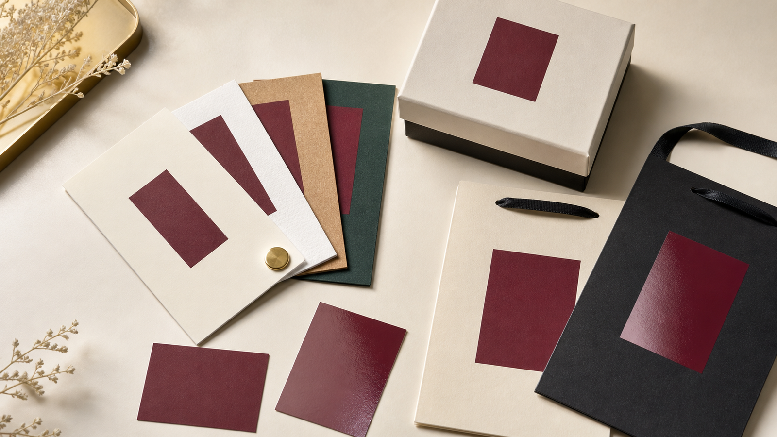
Printing onto burgundy, green, navy or black paper needs special planning. Some inks will not appear accurately without an opaque base. In other cases, foil stamping, screen printing or a contrasting paper wrap may create a cleaner result than trying to reproduce a light colour directly.
Finishing also changes how colour is perceived
The printed colour is only one part of the final appearance.
A gloss lamination can make colours feel deeper and more saturated. A matte or soft-touch lamination may reduce glare and make the same artwork appear quieter. Varnish can add contrast between selected areas, while embossing changes the way light falls across the surface.
For rigid gift boxes, the printed sheet may be wrapped over greyboard. For paper bags, the same brand colour may be printed on a different paper weight using a different process. Even with one Pantone reference, the finished bag and box may not look perfectly identical.
If the paper bag and gift box form one packaging set, compare them together during sampling. The practical goal is a coordinated family, not a promise that different materials will behave like the same surface.
How should packaging artwork be prepared?
Before production, give the supplier a clear colour specification rather than relying on what the file looks like on screen.
- Keep an editable master file. Vector logos and text should remain editable where possible.
- Separate digital and print references. Keep RGB or HEX values for online use, and define CMYK or Pantone references for print.
- Name spot colours clearly. If a Pantone colour is required, include the full number and coated or uncoated suffix.
- Ask about the output profile. Do not repeatedly convert images between RGB and CMYK. Confirm how the printer wants images and process colours prepared for the selected press and paper.
- Identify finishing separately. Foil, embossing, debossing, spot varnish and white ink should be clearly labelled in the artwork.
- Keep the dieline separate. Cut lines, folds, glue areas and artwork should be organised so production information does not accidentally print.
- Share a physical reference when colour is critical. A previous package or approved printed swatch can communicate more than a screen image.
If you do not have a production-ready file, that is not a reason to delay the conversation. A logo, reference image and preferred colour direction are enough to begin planning.
What does a proof really confirm?
Digital PDF proof
A PDF proof is useful for checking text, artwork position, size, orientation and basic colour separation. Because it is still viewed on a screen, it does not confirm the exact printed colour.
Digitally printed sample
A digital sample can provide a helpful impression of scale, artwork and colour direction. If final production uses another print process, the colour may still change.
Production-method sample or wet proof
A sample made with the intended material, ink and print method gives the strongest basis for colour approval. It can cost more and take longer, so it is most useful when colour is commercially important.
Always check what type of proof is included in the quotation and what it is intended to approve.
A practical colour brief for paper bags and gift boxes
When requesting a quotation, send as much of the following as you have:
- packaging type and finished dimensions;
- paper or material preference;
- quantity;
- logo and artwork files;
- CMYK values or Pantone references;
- a photo or physical sample of an approved brand colour;
- required finishes such as foil, embossing or lamination;
- whether several packaging items should coordinate;
- delivery destination and target date;
- preferred sampling route.
For custom paper bags, also confirm the handle material and colour. For gift boxes, include the box structure, paper wrap and insert material. These details can all influence how the finished colour is perceived.
Colour planning should happen before production
RGB, CMYK and Pantone are not competing answers to the same question. They serve different parts of the design and production process.
RGB helps a brand communicate on screen. CMYK makes detailed full-colour printing practical. Pantone provides a shared physical reference when a specific colour needs closer control.
Bespoke Packaging helps independent fashion, jewellery, beauty and lifestyle brands turn those references into workable paper bags and gift boxes. We can compare the artwork, material, finishing, quantity and budget, then recommend a practical colour and sampling route before production begins.
If you are planning a coordinated paper bag and gift box set, send us your logo, preferred colours, product dimensions and quantity. We will help you identify what should be printed in CMYK, what may benefit from a Pantone reference and what should be confirmed with a physical sample.
Is your packaging colour currently defined for a screen—or for the material it will actually be printed on?