
LUXURY PAPER BAG ARTWORK GUIDE
Luxury Paper Bag Artwork: Dieline and File Checklist
A practical file and dieline checklist for turning a premium shopping bag concept into artwork a supplier can review and produce.
Print-ready artwork for a luxury paper bag is the approved design placed on the supplier’s actual flat bag dieline, with production instructions for colour, printing and any special finish. A logo image alone communicates the idea, but it does not tell the factory how that design should cross a gusset, avoid a handle hole or continue into a folded top.
For a premium shopping bag, these details affect the customer’s first view of the brand. A beautiful front-panel mock-up can still fail when the bag is assembled: a motif disappears into a side fold, a foil mark lands too close to a crease, or a dark background stops short of the turned edge. This guide gives buyers and designers a clear handoff sequence. Exact bleed, clearance and file settings must come from the supplier and the chosen production process; they are not universal numbers.
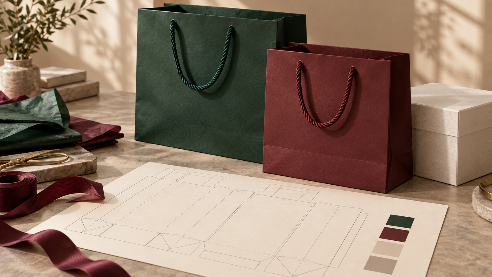
What should you ask for before placing artwork?
Ask the supplier for the approved dieline for the selected size and construction. It should identify the front and back faces, both gussets, top turn-over, seam or glue flap, bottom folds, cut and crease lines, handle positions and any reinforcement that changes the printable area. Also request the required bleed, safe area, preferred file format, colour profile and separate-file rules for foil, embossing or other finishes.
Use a structural sample if the bag is still being sized. The usable artwork area can change when the bag width, gusset, top fold or handle construction changes. Our paper bag size guide covers product fit; the construction guide explains why folds, reinforcement and the base belong in the specification. Freeze that structure before treating the art file as final.
How do you read a paper bag dieline?
A dieline is the flat production map of a finished bag. It shows where the printed sheet is cut, creased, folded and joined. The artwork must be placed on this map at full scale and in the correct orientation. Ask for a labelled version for design review and follow the supplier’s instructions for the production version. Do not redraw a dieline from a product photograph or assume that one bag format uses another format’s fold map.
Front, back and gussets
Decide which face the customer sees first and whether the back repeats the same artwork. Then review the bag as a three-dimensional object. A side gusset may appear narrow when folded but open widely when packed; a graphic spanning front and side may look interrupted at the crease. If continuous artwork is important, have the supplier make a folded mock-up or sample rather than judging only the flat PDF.
Top turn-over, handle holes and base
Keep important words, small logos and fine detail out of the handle attachment and fold zones. Check what is visible below the turn-top and what becomes hidden inside. If the background colour wraps around the edge, artwork may need to continue into that fold. A base panel can be visible when the bag is carried or set down, but much of the bottom construction is hidden after assembly. Mark any deliberate base design explicitly instead of letting the production team infer it.
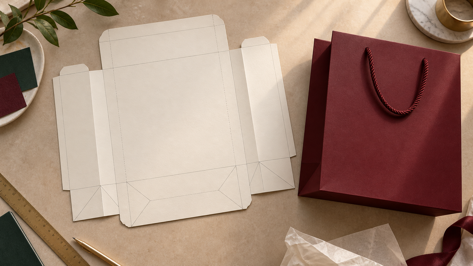
Where do bleed and safe areas matter?
Bleed is extra background artwork extending past a cut edge so small cutting variation does not expose an unintended unprinted sliver. A safe area keeps essential content away from cuts, folds, handle holes and glue zones. They solve different problems: a full-colour burgundy background may extend into bleed, while the brand name stays comfortably inside the safe area.
Adobe’s print guidance explains bleed as artwork outside the trim boundary and says the print shop should advise the amount required for a particular job. For a bag, ask the supplier to mark every relevant cut and fold edge, not just the front rectangle. Do not apply a generic web-to-print margin to the entire flat sheet without checking seam, base and top construction.
Which artwork files are most useful?
Provide the editable source file when available, plus a review PDF that shows exactly what the designer intends. A vector logo stays sharp when the bag size changes or a foil tool is made. Photography and other raster images can work well for process printing, but they need enough effective resolution at the placed size. A screenshot, small web JPEG or low-resolution logo is useful as a visual reference, not as a dependable master for a premium printed carrier.
Confirm how fonts and linked images should travel with the source. Adobe’s Illustrator packaging feature inventories used and missing fonts, missing links and linked or embedded images. If the supplier wants text outlined, retain an editable working copy before outlining; if it wants a PDF with embedded fonts, follow that route. Give files clear version names and identify the approved master so an older proof cannot be mistaken for final artwork.
Should the final file be PDF/X?
Ask the printer which PDF preset and output condition it supports. Adobe describes PDF/X as a print-exchange standard that reduces common colour and font uncertainties, and notes that different PDF/X variants serve different workflows. Exporting to an arbitrary preset is not a substitute for confirming the supplier’s requirements. Supply the editable original alongside the output PDF when requested, especially if a last production adjustment is likely.
How should colour be specified for a luxury bag?
State whether a design uses process colour, a named spot colour, a paper colour or a separate decorative process. Do not rely on the appearance of a phone screenshot. Adobe explains that CMYK and spot colours create different separations; the supplier should confirm which plates or digital workflow will reproduce the design. Our packaging colour guide gives buyers a broader overview of digital and physical colour references.
State the chosen paper next to the colour target. Pantone notes that the same colour can look different on coated and uncoated paper. For a forest-green bag with an ivory rigid box and burgundy ribbon, approve the actual components together under suitable light. A shared colour name does not guarantee an identical appearance across paper, ribbon and different production processes.
How do foil, embossing and spot finishes appear in the file?
Show each special finish as an unambiguous, separately named production element, positioned against the correct bag panel. A gold-looking shape in a mock-up does not tell a supplier whether to print gold ink, apply foil or leave a metallic material exposed. Likewise, an embossed logo must be identified as raised or recessed and checked against folds, handle attachment, paper surface and the supplier’s tooling limits.
Ask how the supplier wants finish artwork represented: a separate vector layer, spot-colour plate or separate file. Review each separation, its registration to the printed design, and the effect on the assembled bag. Adobe’s separations preview guidance is useful for detecting unintended spot colours and overprint behaviour, but a physical strike-off or pre-production bag remains the more relevant approval for tactile effects. See our finish comparison for choosing the effect itself.
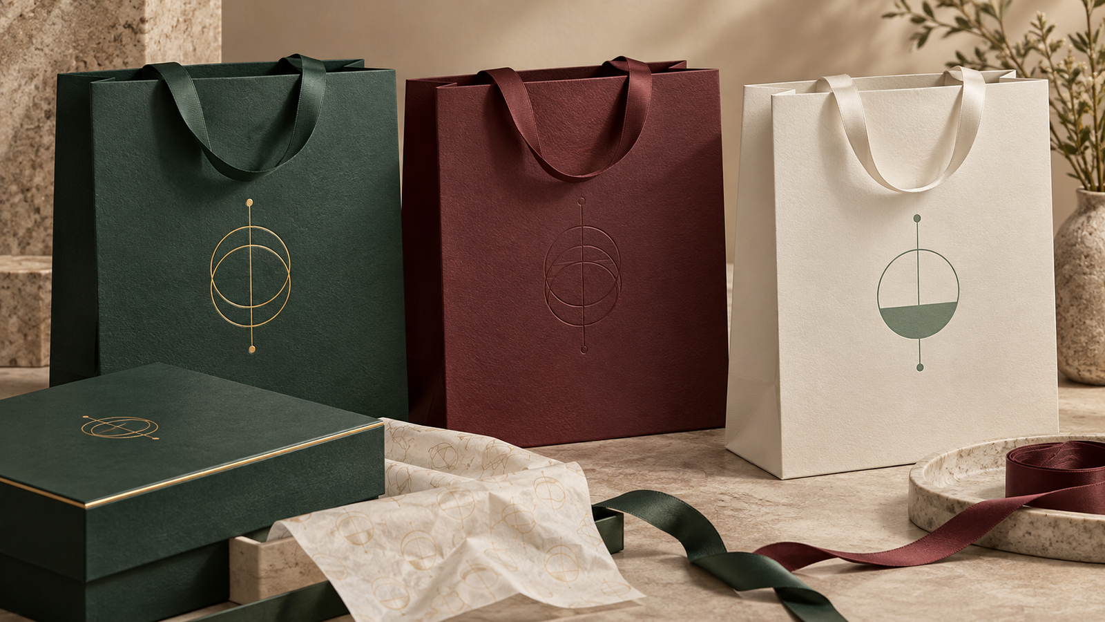
What if the bag is part of a complete gift set?
Prepare a small system rather than matching every component mechanically. Identify the lead brand mark, the colour relationship and the finish hierarchy across the luxury paper shopping bag, rigid gift box, ribbon and tissue paper. State which marks must align visually and which surfaces may differ. For example, a restrained foil emblem on the bag can pair with a blind-embossed box and plain tissue; each material need not repeat every effect.
Give the supplier a finished-pack photograph or a simple layout showing how the items will be presented. This helps identify whether the bag artwork is partly covered by tissue, whether the ribbon colour competes with the bag face and whether the customer sees the back panel at retail handoff. Keep separate approved art files for each component while recording the common colour and brand references.
What should be checked before approving the artwork?
Review the flat file and an assembled view. The first catches technical omissions; the second catches design decisions that change when the sheet becomes a bag. The sample approval guide explains which physical or digital proof answers which question. Record any approved change in a new file version rather than annotating an old mock-up and assuming production will reconcile them.
- Confirm the dieline revision, finished bag size and orientation match the quoted construction.
- Check every face, gusset, turn-top, handle position, seam and base after folding.
- Verify the supplier’s requested bleed and safe areas; keep essential marks clear of hazards.
- Confirm editable logo art, image quality, fonts, linked files and PDF export settings.
- Identify process inks, spot colours, stock colour and the physical colour reference.
- Keep foil, embossing, debossing and selective coating instructions separate and named.
- Read every word, URL and code on a full-size proof; test any scan code on the actual printed sample.
- Approve the final file version, physical sample if needed, and the person authorised to release production.
Frequently asked questions
Can I send only a logo to request a quote?
Yes, for an initial discussion. Send the logo with bag dimensions or the products it must carry, quantity, paper and finish direction, and a clear note that final production artwork is pending. The supplier can then advise on a dieline and art-preparation route.
Is a three-dimensional mock-up enough to approve printing?
No. A rendering shows the intended appearance, but it may hide folds, glue areas, colour separations and the true position of the artwork on the flat sheet. Approve the production file against the supplier’s dieline and use a physical sample when colour, finish or assembly is critical.
Is there one standard bleed for every luxury paper bag?
No. The required extension depends on the supplier’s cutting, folding and printing process, and different areas of the flat sheet may need different treatment. Use the bleed and safe-zone values shown on the approved job-specific dieline.
Send a bag file the factory can use
Good artwork handoff connects a design idea to a real bag: the agreed structure, the supplier’s dieline, correctly placed graphics, clear production separations and a documented approval. The result is a more reliable route from a premium concept to the finished carrier a customer takes home.
Bespoke Packaging can help develop a coordinated set of custom paper bags, gift boxes, ribbon and tissue paper. Send your product or gift-box dimensions, intended bag size, artwork files or visual direction, quantities, finishes and delivery market. We can review the brief, confirm the production artwork requirements and plan a suitable sample and quotation.
Would your current art file still make sense after the bag is folded and carried?