
LUXURY PAPER BAG DESIGN GUIDE
Luxury Paper Bag Design: A Practical Brand Brief
Turn brand strategy, product fit and retail experience into a clear paper bag design brief that a supplier can sample and produce.
A successful luxury paper bag design gives every visible and tactile choice a clear job. The bag size protects the product, the paper establishes the surface character, the brand mark leads the visual hierarchy, the handles support carrying and touch, and any foil, embossing or pattern reinforces rather than competes with that hierarchy.
For a brand team, the practical output is not only a beautiful front-view mock-up. It is a design brief that connects the real product, retail handoff, bag family, artwork, materials, construction, samples and complete packaging set. That brief helps a supplier price comparable options and identify technical conflicts before production.
This guide focuses on the creative and commercial decisions that come before production artwork. For file setup, panel mapping and bleed, use our luxury paper bag artwork checklist. For print processes, see the paper bag printing guide.
What makes a luxury paper bag design feel considered?
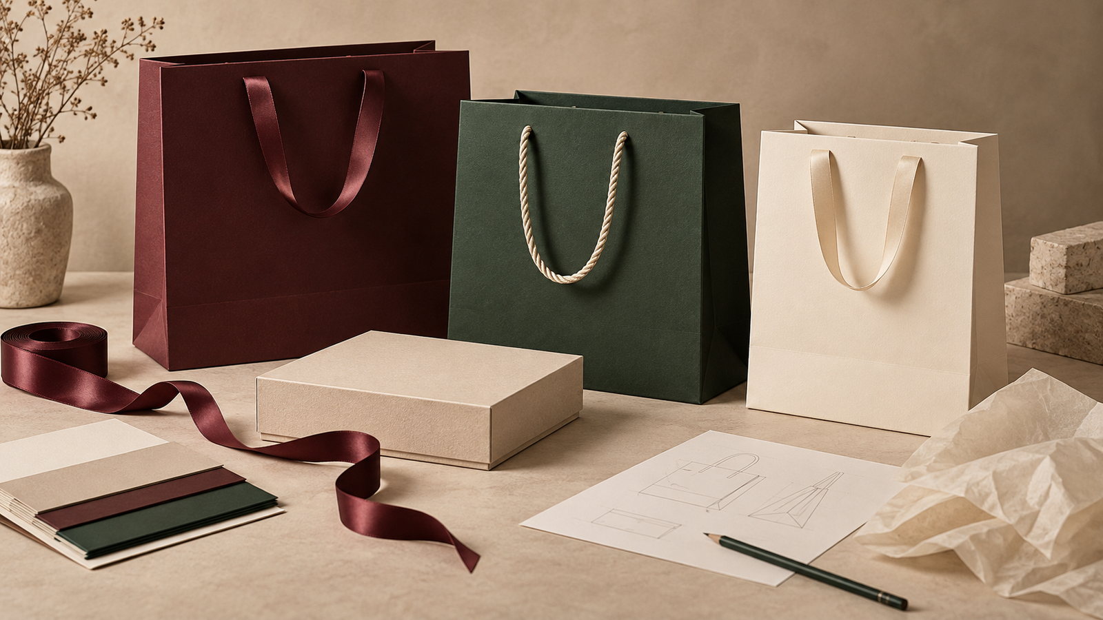
A premium design usually feels intentional because the choices form one system. Proportion, colour, typography, mark placement, handle material and finish should tell the same story at the same level of intensity. Luxury does not require every available decoration. A quiet bag with tactile paper, clean construction and one controlled focal point can communicate more clearly than a bag carrying several unrelated effects.
- Clear hierarchy: one element leads, while supporting details remain secondary.
- Appropriate proportion: the bag fits the finished product and looks balanced when carried.
- Material honesty: the design works with the selected paper rather than hiding an unsuitable surface.
- Useful restraint: every colour, pattern and finish earns its place.
- Consistent touchpoints: the paper bag, rigid box, tissue and ribbon feel related without becoming identical.
- Production awareness: important details stay clear of folds, handle holes, seams and other conversion zones.
These are design principles, not a fixed luxury formula. A fragrance launch, jewellery boutique and fashion flagship may need very different levels of contrast and decoration. The brief should describe the intended experience and the operational conditions rather than copying the appearance of another brand.
What should the design brief define first?
Begin with the use case. The same logo can lead to different bags when one carries a compact jewellery box, another holds folded apparel and a third contains a boxed bottle. Before discussing colour or foil, record the finished pack dimensions, maximum packed weight, expected quantity, delivery markets, target date and the way the bag will be filled and handed to the customer.
| Brief question | Why it changes the design | Evidence to provide |
|---|---|---|
| What goes inside? | Controls size, proportion, base support and carrying load | Finished product or gift-box dimensions and packed weight |
| Where is the bag used? | Changes viewing distance, handling, weather exposure and retail workflow | Store, event, gifting or delivery scenario |
| What should the customer notice first? | Defines the visual hierarchy | Primary mark, message or signature colour |
| Which elements are fixed? | Separates brand rules from open design choices | Approved logos, colours, typefaces and claim rules |
| How many formats are required? | Determines whether the system must scale across a family | Product matrix and estimated quantities by size |
Use the actual finished product pack as the sizing reference. Our luxury paper bag size guide explains width, gusset, height and fit allowances in more detail. A front-panel design cannot rescue a bag that is awkward to load, unstable at the base or oversized around a small product.
How do you build a clear visual hierarchy?
Choose the first, second and third things a customer should notice. The lead element might be a wordmark, a small emblem, a distinctive colour field or a controlled pattern. Supporting information can be quieter and may belong on the back panel, side gusset or inside rather than sharing equal weight on the front.
Adobe’s guidance on colour contrast describes how differences in colour, value, size, shape, texture and position can guide the eye and establish hierarchy. For a paper bag, test that hierarchy at full size. A composition that feels balanced on a laptop may become too empty, too loud or difficult to read when enlarged and folded into a physical carrier.
- Identify the primary cue. Decide whether the brand mark, colour or pattern should lead.
- Reduce competing elements. Remove decoration that does not strengthen the main cue.
- Check front, back and side views. A customer and people nearby see more than one panel while the bag is carried.
- View at realistic distance. Check close handling, counter display and movement through a retail environment.
- Test with handles and folds visible. They are part of the composition, not hardware added after design approval.
How should one design scale across a bag family?
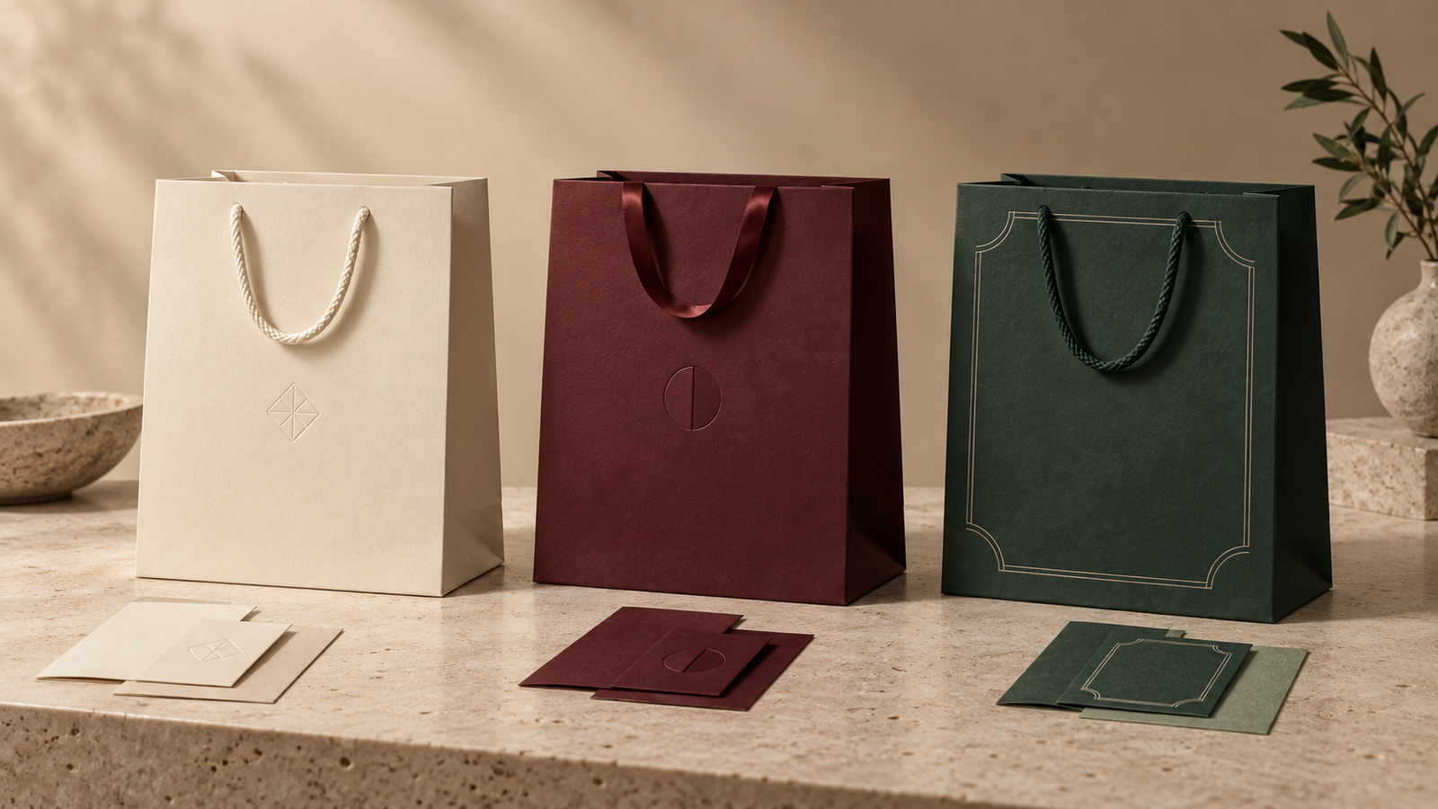
A useful bag family repeats a recognisable system rather than forcing the same artwork to the same percentage on every size. A compact jewellery bag, medium boutique bag and wide gift-set bag have different panel proportions. A mark that looks confident on one format can appear lost or crowded on another.
Define what remains constant and what may adapt. The paper and handle family might stay consistent while logo scale, pattern crop or secondary text changes by format. Create an artwork rule for portrait, landscape and compact proportions. Then place real products into each bag and photograph the family together. This reveals whether the formats feel related and whether one member dominates for the wrong reason.
How do paper and colour change the design?
Colour is never independent of the substrate. Coated, uncoated, kraft, recycled and coloured-through papers differ in shade, texture and ink behaviour. The same digital colour value or named spot colour can look different when the paper surface changes.
Pantone explains that its coated and uncoated references show colour appearance on different paper types; uncoated paper absorbs more ink, while ink sits more on the surface of coated stock. Specify the relevant physical reference and approve it on the intended paper instead of treating a screen display as the final result.
Paper choice also changes contrast and detail. Fine reverse text may need more care on a fibrous sheet. A blind deboss can become the main feature on a tactile uncoated paper, while a smooth coated surface may support sharper printed detail. Use the luxury paper bag materials guide to compare the main substrate families, then request physical swatches before finalising the palette.
Should the handles match or contrast?
Handles sit in front of the artwork and become the first touchpoint, so their colour, width, texture, drop and attachment belong in the design brief. A matching handle can make the bag feel monolithic and calm. A contrasting handle can create a deliberate accent or connect the bag to a ribbon used on the gift box.
Do not choose by colour alone. Cotton rope, woven cord and satin ribbon reflect light and compress differently. A ribbon can read as elegant on a small bag but may twist or feel narrow with a heavier pack. A thicker rope changes the visual weight near the top edge. Specify the carrying requirement first, then choose a material and colour that support both function and appearance. Our paper bag handle guide compares these options in detail.
How many finishes should a premium bag use?
Use finishes to strengthen the hierarchy. Foil can create a reflective focal point, embossing or debossing can add tactile relief, and spot gloss can introduce contrast against a matte surface. If all three are equally prominent, the customer may not know where to look and the quotation, sampling and inspection become more complex.
A practical first concept often uses one hero effect supported by the paper and print. Show a second option only when it answers a different brand or budget direction. Record the exact location, approximate area and desired character of the effect, then confirm feasibility on the supplier dieline and a physical sample. The luxury paper bag finishes guide explains the process choices and compatibility checks.
Where can secondary design details live?
The front panel does not need to carry every message. Side gussets can hold a subtle pattern, short brand line or colour shift. The back can carry secondary information where appropriate. An inside print or coloured turn-top can reward close handling, but it should be assessed against production method, ink coverage, rub risk and cost.
Keep variable campaign copy, legal text and market-specific statements under version control. Avoid placing important information across folds, close to handle holes or near the side seam until the converter confirms the usable area. A three-dimensional render is useful for discussion, but the supplier’s current dieline and a converted sample remain the production references.
How should sustainability claims affect the artwork?
Design space for environmental or certification claims only after the claim, evidence and label rules are confirmed. Paper appearance alone does not prove recycled content, responsible sourcing or recyclability. Keep these claims separate in the brief and identify who will approve each one.
FSC published version 3-0 of its trademark standard in January 2026, with new requirements effective from 1 July 2026 and a transition period to 1 January 2029. If an FSC label is proposed, use the correct approved artwork and certificate-holder process rather than redrawing or styling the mark to fit a concept.
For recyclability, assess the whole construction rather than only the body paper. The 4evergreen Circularity by Design Guideline 2026 considers components and relevant recycling pathways, including conventional, flotation-deinking and specialised processes. Handles, reinforcement, coatings, lamination, adhesives, inks and decorative effects can all matter. Our separate recyclable luxury paper bags guide gives buyers a fuller evidence checklist.
How do you coordinate the bag, box, tissue and ribbon?
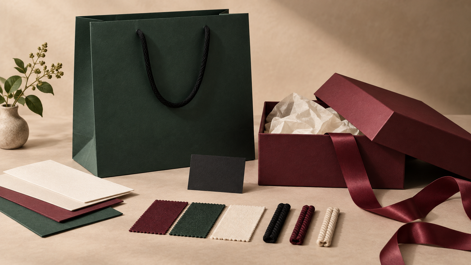
Give each component a role. The paper bag is the public carrier, the rigid box protects and presents the product, tissue controls the reveal, and ribbon supplies closure or ceremony. Repeating every colour and finish on every layer can flatten that sequence. Instead, choose one or two recurring cues—such as a burgundy accent, a small geometric mark or a shared tactile paper family—and vary their intensity.
- Place the finished rigid gift box inside the proposed bag to confirm scale and loading.
- View tissue against both the product and the inside of the bag or box.
- Compare ribbon and handle colours under the same light; similar digital values may not match across paper and textile.
- Decide which component carries the strongest finish and which ones remain quiet.
- Approve the complete set together, not as separate supplier photographs.
What should a supplier-ready design brief include?
- Use case: product, retail channel, carrying journey and customer experience.
- Bag formats: finished dimensions or products to be measured, quantities and estimated packed weights.
- Brand assets: current vector logos, colour references, typefaces and mandatory or prohibited uses.
- Hierarchy: the primary visual cue and the role of every secondary element.
- Material direction: preferred paper character, shade and any sourcing requirement.
- Handle direction: material, colour, approximate drop and carrying requirement.
- Decoration: print intent, hero finish, location and acceptable alternatives.
- Packaging set: boxes, tissue, ribbon, cards or other components that must coordinate and fit.
- Claims: exact proposed wording, evidence owner and approval route.
- Approval plan: swatches, structural prototype, colour proof, finish trial and complete pre-production sample as needed.
- Commercial context: delivery destination, target date and information required for a comparable quotation.
Separate the creative target from the fixed specification. A mood board can communicate atmosphere, but it should not be mistaken for an approved colour, paper grade or finish. Likewise, a supplier may suggest a more practical route after seeing the bag size, quantity and artwork. Record that change in the brief so the quotation, sample and final order remain aligned.
How should the design move from concept to sample?
- Approve the direction. Select the hierarchy, palette, paper character, handle family and finish strategy.
- Confirm size and construction. Test the actual packed product before final artwork.
- Request the supplier dieline. Map the approved concept to real panels, folds, seams and handle positions.
- Review production artwork. Check versions, colour separations and finish layers.
- Approve physical evidence. Use the right combination of paper swatches, proofs, prototypes and finished samples.
- Freeze one reference. Keep signed artwork, written specifications and the approved master together for production and inspection.
The appropriate sample depends on what is still uncertain. A digital render can confirm composition, a plain prototype can prove size, and a finished sample can show the interaction of paper, print, handles and decoration. Our custom paper bag sample guide explains what each stage can and cannot prove.
Frequently asked questions about luxury paper bag design
Can a simple paper bag design still look luxurious?
Yes. Simple can feel premium when the proportion, paper, construction, handle and one leading brand cue are carefully resolved. Minimal artwork does not compensate for weak fit or poor manufacture, but it can create a confident hierarchy when the physical bag is well specified.
Should the logo be centred on a luxury paper bag?
Not necessarily. Centring is a reliable option, but an offset mark, small lower placement or controlled side-panel treatment can also work. Judge the placement on the complete bag with handles, folds and product inside, then confirm safe areas on the supplier dieline.
Do all bag sizes need identical artwork?
They need a recognisable system, not necessarily identical scaling. Define rules for logo size, margins, pattern crop and secondary information across portrait, landscape and compact formats so each bag feels balanced.
When should a packaging supplier join the design process?
Bring the supplier in once the use case, approximate size, quantity and creative direction are clear, and before the concept is treated as production-ready. Early technical feedback can reveal constraints around paper availability, print, folds, handles, finishing, samples and lead time.
What files are needed after the design is approved?
Prepare editable vector artwork, linked assets, font information or outlined type where agreed, colour specifications, and clearly separated layers for foil, embossing or other special processes. Place the final design on the supplier’s current dieline and follow its file, bleed and safe-area requirements.
Turn the design direction into a bag you can approve
The strongest luxury paper bag design brief connects brand intent with the real product and the real manufacturing route. Define the hierarchy, scale it across the bag family, see colour on the chosen paper, treat handles as part of the composition, use finishes with restraint and approve the entire packaging set physically. That gives the supplier enough context to quote, sample and produce the design without guessing what “premium” means.
Build a sample-ready luxury paper bag brief
Share your product dimensions, estimated quantity, delivery market, brand assets and visual direction. Bespoke Packaging can help turn them into a coordinated paper bag, rigid box, tissue and ribbon specification for quotation and sampling.